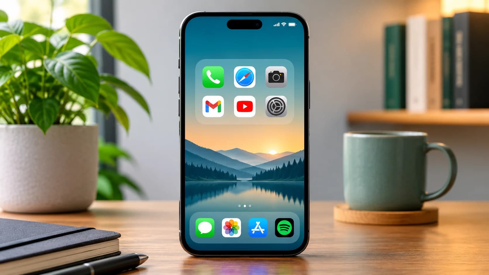
How to Organize Your Phone Home Screen

Mahmud Hasan
November 4, 2026
Unlock your phone and count the swipes it takes to open the app you actually wanted. Learning how to organize your phone home screen is less about taste than about taps: every extra swipe is a small tax on the thing you meant to do. For most people the answer is embarrassing: past a page of apps they installed in 2022, into a folder called Misc, past three more apps they forgot they had. Your home screen was never designed. It accumulated, one install at a time, in install order. The fix takes about fifteen minutes, and it is not a prettier wallpaper. It is treating page one as a dashboard, naming folders by what you do, and giving work and home different screens.
Count what you actually have
Before you move a single icon, find out how bad it is. On an iPhone, open Settings > General > About and look at the number next to Applications. On Android there is no single count, so swipe through the app drawer and count the pages instead. Most people land somewhere between 60 and 120 apps spread over three or four pages, and use about ten of them daily.
That gap is the whole problem. A home screen that holds 90 apps cannot also be a quick launcher. So start with the audit, and be blunt about it. Anything you have not opened in 30 days comes off the home screens. Not deleted — removed. On an iPhone, press and hold the icon, choose Remove App, then Remove from Home Screen; the app stays in the App Library, one search away. On Android, long-press and drag to Remove; that takes the shortcut off Home and leaves the app in the drawer. If you cannot remember what an app does from its icon alone, that is your answer.
Here is the arithmetic that makes the case. Take a typical four-page phone. An app buried on page three inside a 20-icon folder costs you an unlock, two swipes, a folder tap, and a scan of twenty near-identical icons — four or five actions before anything happens. The same app on page one costs an unlock and one tap. Do that twenty times a day and the messy layout is quietly taxing you a hundred extra actions daily, all for apps you chose to keep in the way.
Page one is a dashboard, not a drawer
Page one should hold only what you reach for every day, plus one widget that saves you opening an app at all. A calendar widget or a weather widget earns its space; a second row of social apps does not. Aim for eight or fewer icons on page one, and put your four most-used apps in the dock, where they stay visible on every page.
Everything else moves to page two or into the App Library or app drawer. This is the part people resist, because it feels like hiding things. It is the opposite: the drawer and the App Library are searchable, so an app you need twice a year is one typed name away either way. What changes is that the apps you need twenty times a day stop competing with it for your attention. If your worst time-sinks live on page one, moving them is also the cheapest version of the friction-first approach to doomscrolling — one extra tap between you and the feed is worth more than any screen-time lecture.
Organize your phone home screen by verbs, not categories
Most folder systems fail the same way: a folder called Social ends up holding twenty apps, which is no better than twenty loose icons. Categories describe what apps are. Verbs describe what you do, and that is a much smaller list. Try five folders, capped at nine apps each so everything inside is visible at a glance without swiping:
- Message — only the apps where you actually talk to people: your messenger, SMS, and work chat. Not every app with a comment section.
- Pay — banking, cards, and the wallet. Keeping money apps together also means you notice faster when a new one appears.
- Read — news, books, and the read-later app. This is the folder to open when you have five minutes, on purpose.
- Move — maps, rides, fitness, and travel. One folder for everything that gets you somewhere.
- Work — email, calendar, notes, and documents. If it is not in here, it does not follow you into the workday.
Run your own inventory through that test and watch what happens to the usual suspects. A shopping app is not "Shopping" — it is either Pay, if you buy in it weekly, or it leaves the home screens entirely. A social app with a feed is not "Social" — it is Read only if you genuinely read in it, and otherwise it belongs in the drawer. The sorting forces a decision about each app instead of letting it sit in a category that excuses it. A folder with one app in it is fine; a folder with twenty is a drawer wearing a label.
Give work and home different screens
If your phone pulls double duty, one layout cannot serve both halves of your day. On an iPhone, Settings > Focus lets each Focus mode show only the pages you pick for it: a Work focus that shows the Work folder and calendar, a Personal focus that shows photos and music and hides the work apps entirely. Set the Work focus on a schedule, and the phone rearranges itself when the workday ends — no willpower required, which is the entire point. A focus system, not willpower, is what survives a bad week.
On Android, the equivalent is a second page plus your phone's Focus mode, found in Digital Wellbeing on Pixel and Galaxy phones, which pauses the apps you choose until you switch it off. Put the work page second and the personal page first, or the reverse if your evenings are the problem. Either way, the rule is the same: when a mode is on, the apps outside it should take a search to reach, not a glance.
Stop the refill
Every system above rots within a month unless you close the tap that refills it. New apps land on your home screens by default, and one install a week rebuilds the clutter you just cleared. On an iPhone, go to Settings > Home Screen & App Library and set newly downloaded apps to App Library Only. On a Pixel, long-press a blank area, open Home settings, and switch off adding app icons to the home screen; on a Galaxy phone the same toggle lives under Settings in the home-screen menu. From then on, a new app has to earn its place: you add it deliberately, or it stays in the library.
Then keep a two-minute reset. Once a week — Sunday evening works — swipe through your pages and remove anything that crept back. No reorganizing, no rethinking the system, just eviction. On an iPhone you can also hide a whole page instead of dismantling it: in edit mode, tap the page dots and uncheck the page. The apps stay in the App Library, and the page is one tap away from returning if you ever actually miss it.
Do it in this order and it fits in fifteen minutes: five for the audit, five for the dashboard page, five for the verb folders and the focus setup. You will end up with one page you use, one page you mean, and a library that holds the rest without apology. The phone does not get simpler. It gets out of the way, which was the job all along.
References
- Popular Science — How to organize smartphone home screens (David Nield, Jan 2024)
- Swappa — How to Actually Organize Your iPhone Home Screen (iOS 27 guide, Apr 2026)
- Oak Park Public Library — Tech Tips Smartphone 101: How to use & organize your smartphone home screen
- Technobezz — How to Set Up and Customize Your Google Pixel Home Screen (Sep 2026)
Comments
More in Life & Productivity
How to Take a Screenshot on Windows 11: Every Method
How to take a screenshot on Windows 11: every method, where each file actually lands, and what to do when the Print Screen key does nothing at all today.
Read more