
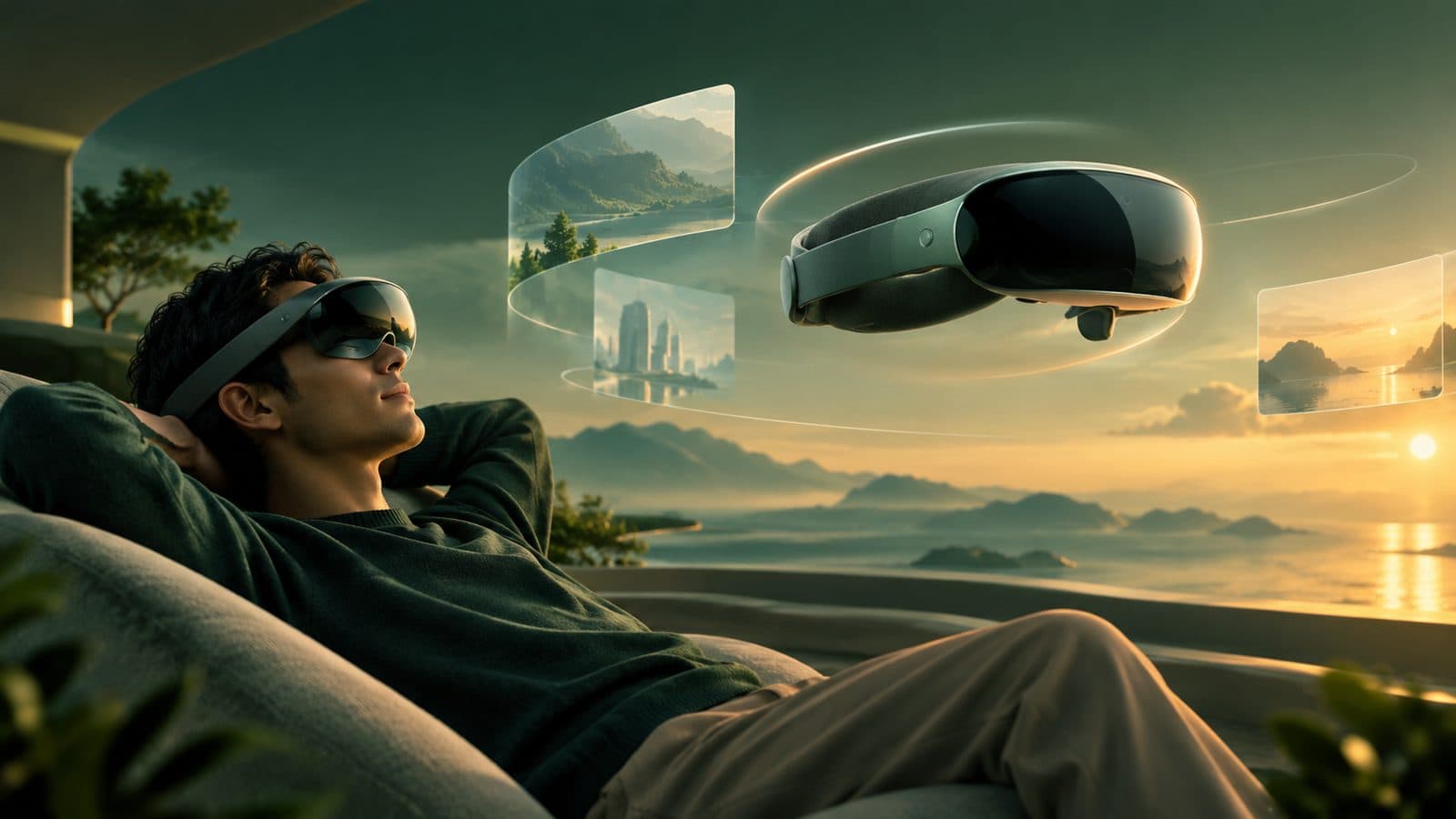
The Best Headset UIs Are the Ones You Barely Move For

Mahmud Hasan
October 5, 2026
Three weeks ago Apple shipped visionOS 27, and the most important thing in it isn't a window, a widget, or a gesture. It's a voice. Siri AI arrives as a persistent orb you pin in your room and talk to by looking at it — no wake phrase required. That's the direction of travel: the interface is leaving the screen.
But the rules that will still matter in a decade were written before this update — in Apple's design guidelines, in WWDC talks, and in a lot of designers' sore necks. I've spent the week reading them alongside practitioners' post-mortems, and the settled wisdom is wonderfully unglamorous: design for the body first, and the wow takes care of itself.
Rule one: find the key moment
Apple's guidance has one blunt sentence at its center: don't window a 2D app. If your product is a spreadsheet floating in someone's living room, you built a floating spreadsheet — not spatial software.
The alternative the guidelines push is the "key moment": the one thing your experience can do that is only possible because the computer knows where your body is. Find it, and build around it. Everything else should stay familiar. As one veteran designer put it, when you want to say something new, use a familiar language. An app where every interaction is novel is an app nobody understands on day one — so pick your battles. One innovation per experience, the rest borrowed from what people already know. It's a ruthless filter: a virtual piano earns its place only if the keys sit on a real desk, so your hands get the contact they expect. A dashboard floating in midair fails — until walking around the model is the point.
Your user's body is the viewport
On a phone, the viewport is a rectangle. On a headset, the viewport is a neck, two shoulders, and a pair of eyes that get tired. That reframes every layout decision.
People are, functionally, lazy — the more physical effort your app demands, the less they'll use it. So interaction at a distance is the default: eyes target, hands rest in the lap. Direct touch is reserved for close-up manipulation, and you still owe the user compensation for missing tactility: buttons that brighten as a finger approaches, state that snaps on contact.
The ergonomics have numbers. Layouts run wide, not tall, because turning the head side to side is easier than tilting it up and down; primary content sits along the natural line of sight, a bit beyond arm's reach, with reading material dropped slightly below eye level. Interactive elements need at least 60 points of target area — roughly 2.5 degrees of visual angle. Stacked buttons sit at least 16 points apart so the hover highlight doesn't bleed into its neighbor.
And the part designers most often get wrong: comfort is your app's problem, not the headset's. Users will blame the hardware when your app makes them queasy, but every app owns its perceptual load. Depth cues have to agree with each other — size, blur, shadow, occlusion — or the eyes fight and fatigue follows. Large moving content that fills the view reads as self-motion to the brain, so it has to go semi-transparent to keep the real room as an anchor. Nothing gets locked to the skull; if you must pin something, keep it small, central, and far, or let it lazily follow. When the scene has to move, fade out and fade back — never fling the user.
Depth is a hierarchy device, not a toy
Everyone's first instinct with a spatial canvas is to make everything three-dimensional. Three years of shipping apps killed that instinct. The mature rule is 2.5D: a basically flat interface with just enough depth to communicate hierarchy. A modal pushes its parent gently backward — that's the whole vocabulary. Keep text flat; 3D type is unreadable the moment you view it at an angle.
The materials changed too. Window backgrounds should be glass, never solid. Solid colors block out the room and don't adapt to lighting. On that glass, typography runs heavier than iOS: body text goes medium instead of regular, titles go bold instead of semibold. Brand color goes in backgrounds and whole buttons, never in glyphs — the system colors are calibrated for legibility, and your logo blue is not.
2026: the interface is leaving the screen
This is where visionOS 27 — released September 14, free for every Vision Pro — matters: not for its feature list, but for what it admits. Apple has concluded that spatial interfaces get overwhelming fast, and the fix is AI assistance as the bridge between what you want and a room full of controls.
Siri AI is the flagship: a beta rolling out on a waitlist, English first, running on next-generation Apple Foundation Models — reportedly co-developed with Google — split between on-device and Private Cloud Compute. On Vision Pro it takes spatial form: a persistent orb you pin in your room, look-and-speak with no wake phrase, a dedicated Siri app that syncs conversations across your devices, and Visual Intelligence, which lets you ask about whatever you're looking at — a window or a physical object. It even reached the EU on Vision Pro while iPhones there wait.
The smaller changes tell the same story. Notifications you expand with your eyes. Extra-small widgets that don't dominate your field of view. Curved windows that fit human vision instead of pretending the world is rectangular. The thesis of the whole release: the interface should demand less of your body, not more.
Which raises the obvious objection: if everything becomes quiet windows, voice, and restraint, isn't spatial computing just floating iPads? For everyday computing — yes, honestly. Immersion was always a dial: windows for familiar tasks, full environments reserved for the key moment. Immersion migrated to content — immersive video, environments inside Safari — while the UI stays out of the way. The floating iPad was the product all along. The 3D fireworks were the demo.
What to do if you're building
The practitioner's checklist, distilled from people with sore shoulders:
- Prototype with cardboard and masking tape before you open Figma. Tape rectangles to a wall, step back, and feel how much head motion your layout demands. Your neck is the linter.
- Steal from Apple first. Use the system patterns, the glass, the hover effects — and spend your one innovation on the key moment, not the chrome.
- Design in points, not meters. Dynamic scale keeps windows legible at any distance; fixed-scale UI is a legibility bug waiting for a tall user.
- Keep interactive content at one depth. Every focus-depth change is eye strain you're charging the user.
- Respect Reduce Motion with real alternatives — cross-fades instead of oscillation — not just a flag you set.
- Ship accessibility early: alternatives to eyes-and-hands input, captions, Dynamic Type. Spatial computing creates entirely new exclusion modes; retrofitting them later is worse than on flat screens.
The pattern across three years is consistent: every time spatial design got quieter, it got better. Smaller widgets, voice instead of menus, subtle depth instead of spectacle. The canvas is infinite, but the body isn't — and the designers who remembered that are the ones whose apps people still open.
References
- MacRumors — Apple Releases visionOS 27 With Siri AI and New Spatial Experiences
- 9to5Mac — visionOS 27 is here for Apple Vision Pro with these new features
- UploadVR — visionOS 27 Launched For Apple Vision Pro Headsets, Bringing Siri AI & More
- Road to VR — A Concise Beginner's Guide to Apple Vision Pro Design & Development
- icurnvs/codex-apple-skills — visionOS spatial design rules (distilled from Apple's HIG and WWDC23–26)
- Apple Human Interface Guidelines — Designing for visionOS
- Apple Human Interface Guidelines — Spatial layout
Comments
More in Design & Creativity
Apple's New CEO Just Made Himself Its Design Chief. He's an Engineer. That's the Point.
John Ternus visits Apple's design studio several times a week — Tim Cook came about once a month. Seven years after Jony Ive left, the CEO has made himself the company's design chief, and the bet is that one decision-maker beats a committee.
Read more
California Banned Robo Bosses. Your Performance Dashboard Survived.
On September 30, California became the first state to ban AI-only firings. The law has real teeth — but it doesn't touch the surveillance software scoring you every day. Here's the fine print.
Read more
1 in 8 Cancers Starts as an Infection. A Significant Share Is Preventable — We Are Just Not Acting.
A new IARC study published in The Lancet Oncology says 2.3 million cancers diagnosed in 2024 — one in eight — were caused by infections. Unlike the genetics story, most of these are preventable with vaccines, antibiotics, and screening we already have.
Read more