How to Write Good Error Messages: The Five Jobs Every Error Has to Do

Mahmud Hasan
October 12, 2026
Error messages are the only copy every single user reads under stress — blocked, possibly losing work, already annoyed — and they're usually written last, by whichever developer got there first, at 4pm on a Friday. Here's the checklist, drawn from Google's technical-writing course, Nielsen Norman Group's form research, and the Wix UX team's overhaul.
Why error messages fail (it's not the wording)
Most bad error messages aren't a copy problem. They're a process problem: the string gets written in the same commit as the exception handler, by the person closest to the stack trace, whose audience is themselves. So the user sees what the developer saw: Error 422: Validation failed. Accurate. Useless.
The Wix UX team found this in their own audit: messages were merely unclear (fixable with wording) or generic — "Something went wrong" where the system knew exactly what went wrong and didn't pass it to the UI. A roundup of their work reports 7,643 messages reviewed and fixed. The generic ones needed product and engineering work, not editing. If the system knows more than it says, that's a bug, not a sentence.
The second failure is structural: two audiences, one string. The developer wants a searchable code; the user wants to know what to do next. Merged, neither is satisfied. Write two messages — log the code, show the action.
The five jobs every error message has to do
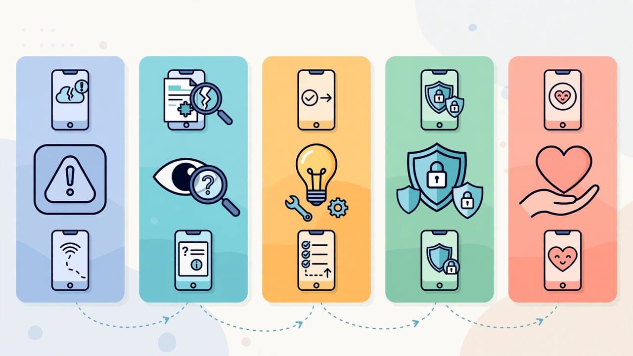
Wix lead UX writer Jenni Nadler defined the complete error message as five jobs, in order. Short surfaces (toasts, inline form errors) can drop the lower ones — never the first.
1. Say what happened, and why. Name what did or didn't happen, plainly. If the cause is on your side, say so — Wix's team deliberately wrote "an issue on our end" rather than leave the user guessing. If the user entered a bad value, name it: "That card number is too short" beats "Invalid input." Google's course says the same in engineer terms: specify the invalid value and the constraint. Vagueness that protects no one is laziness.
2. Say what was not affected. The most-skipped, most-valuable line. The reader is mid-task; their biggest fear is that their work is gone. Tell them: "Your changes were saved, but the email wasn't sent." One sentence turns a panic into an errand. Almost nobody writes this line. Write it.
3. Be empathetic, not cute. When the stakes are high — money, data, access — a joke reads like a surgeon saying "oops" mid-operation. Skip the playfulness. Nadler's team even rationed "please" for dire or unfixable moments. Polite, direct, no exclamation marks.
4. Give the exact next step. Not "Try again" — try what? "Check your connection and try again." "Upload a file smaller than 5MB." No room for the fix? Link to it with a descriptive label — "How do I fix this?", never "Learn more." A link labeled "Learn more" next to an error is a shrug with a URL.
5. Always give a way out. If the user can't fix it, or it might recur, name the escape route: contact support.
The shape:
Unable to connect your account.
Your changes were saved, but we couldn't connect your account because of an issue on our end. Try connecting again — if it keeps happening, contact support.
What happened, what survived, what to do, where to go if it fails. Five jobs, three sentences.
Placement matters as much as wording
NNGroup's form-error research adds the point most copy guides miss: the best-written error message still fails in the wrong place. Their rules, restated:
- Validate inline, next to the field. Flag errors as soon as the user finishes the field. No memory round-trip — they see the fix while fixing.
- Never make the user hunt. A validation summary at the top is a fine overview, but as the only indication it's terrible — by the time they scroll to the field, the message is out of the viewport and out of working memory.
- Don't validate before input is complete. Flagging an email field red mid-typing is the UI equivalent of interrupting someone mid-sentence.
- Never hide errors behind tooltips. Facebook once showed signup errors as alert icons users had to click. Easy to miss on dense interfaces; hiding the diagnosis behind an extra step is obstruction with extra steps.
- Pair color with an icon. Red means error — but color alone excludes colorblind users. Animate the icon if you like; never the text.
- Use modals sparingly. Gmail's "you forgot the attachment" dialog is the canonical good modal: simple, dismiss-and-continue. For anything complex, a modal is a trap — the user dismisses it, then must remember the instructions while fixing the problem.
And the finding with the biggest implication: repeated errors are a design bug, not a user bug. If someone hits the same error three times on one field, the problem is the message, the requirement, or the mental model. NNGroup's line is blunt: when users make errors, it's not their fault; errors highlight flaws in your design. Check analytics for error patterns, test the flow, redesign the requirement before rewriting the sentence.
The honest trade-offs nobody mentions
Two constraints keep error writing honest. The first is security: specificity has a ceiling. Echo back what the user typed, but never passwords or card numbers, and never confirm what an account looks like from the outside ("No account found with that email" is a gift to credential stuffers). Specific enough to act, not enough to fingerprint.
The second is the objection you'll hear in every review: users don't read error messages anyway. Partly true — they skip the ones that look unreadable. A red wall of technical text gets the same treatment as a terms-of-service checkbox. But they read the ones that look answerable: short, next to the problem, starting with the action. The unreadable ones aren't ignored because users are lazy; they were written to be ignored.
Then the consistency trap. Google's course warns against mixing terminology — "directory" in one dialog, "folder" in another. Every synonym betrays the mental model your users are building. Skip double negatives too, and the pile of apologies: one plain acknowledgment beats three "we're so sorry"s. Apologies are cheap; instructions are kind.
What to do this week
You don't need a design team. You need an afternoon and a spreadsheet.
- Run an error inventory. Grep your codebase for error strings into one document. Wix's team started here — the audit itself revealed the generic-vs-unclear split. You'll find duplicates, dead strings, and at least one internal codename.
- Sort by frequency, not embarrassment. Which errors fire most often? Fix those first. The daily payment failure beats the obscure 500 page nobody sees.
- Apply the five-jobs test. What happened? What wasn't affected? Tone calm? Exact next step? Way out? If the product can't answer the first question, that's an engineering ticket — the UI can't say what it doesn't know.
- Add the reassurance line. For every error that can fire mid-task, add one sentence about what survived. Highest-value edit per word in all of error writing.
- Split the audiences. Machine-readable codes go in logs and support tooling. The user-facing string gets plain language and an action. Never the twain shall meet.
Error messages are the only part of your product guaranteed an audience of people having a bad day. Spend one afternoon on them: the user who hits your error is already paying attention. Be worth reading.
References
- Google Developers — Technical Writing: Error Messages (course summary)
- Nielsen Norman Group — 10 Design Guidelines for Reporting Errors in Forms
- Nielsen Norman Group — Nielsen's 10 Usability Heuristics (#9: Help users recognize, diagnose, and recover from errors)
- Jenni Nadler / Wix UX — When life gives you lemons, write better error messages
- Mobbin — Error Message UI Pattern: Best practices & 7 examples
Comments
More in Design & Creativity

In March, Google's AI Tanked Unity's Stock 22%. This Week They're Building Games Together.
Google's Playground turns text prompts into playable browser games, and Unity's Spark will add the professional tier — a direct shot at Roblox from the two companies that fought over AI gaming six months ago.
Read more