
How to Pair Fonts for a Website Without Developing Taste

Mahmud Hasan
October 9, 2026
Web fonts now load on roughly 88% of websites — and most of those sites pair their fonts by vibes. The mechanics behind good pairings are duller and more reliable than anyone admits: pick the body font first, cap yourself at two families, and let contrast and hierarchy do the work. Here's the checklist.
The body font is the real decision
Every bad pairing I've seen started the same way: someone picked a gorgeous headline font, fell in love, then grabbed whatever for the body. Matthew Butterick — whose free book Practical Typography is still the best ten minutes you'll spend on this subject — says to invert that. The typographic quality of a page is determined mostly by its body text, because there's more body text than anything else. So pick the body font first. The headline font is decoration; the body font is the reading experience.
Butterick's ranges are specific enough to use: on the web, body text between 15 and 25 pixels, line spacing 120–145% of the point size (in CSS, line-height: 1.3 as a unitless value), and lines averaging 45–90 characters. NNGroup lands in the same neighborhood — body text at least 16 pixels, generous line spacing — and adds the accessibility floor: at least 4.5:1 contrast for normal text, 3:1 for large text. Check those four things before you touch a second font family. If your body text is 14px grey-on-grey, no headline font on earth saves you.
This also reframes the work. People treat font pairing as 100% of typography; it's maybe 20%. The rest is size, spacing, measure, and contrast. Get the boring part right and an average pairing looks professional. Get it wrong and a beautiful pairing reads like a ransom note.
Two families, and one is probably unnecessary
The consensus across every pairing guide worth reading: two font families, three at most. One for headings, one for body, an optional third only for a genuinely distinct content type — code samples in monospace, say. One typeface can be enough, two is usually plenty, and beyond that you need a reason, not a preference.
Fonts are cheap to load and expensive to look at. The HTTP Archive's 2025 Web Almanac found web fonts on about 88% of websites, and the median font file weighs just 35–36 KB. But every additional family is another voice competing for attention — visual clutter doesn't cost bandwidth, it costs comprehension. If you're tempted by a third family, the honest test: does some content on your page genuinely fail in the first two? If not, put the third font down.
Contrast on one axis, harmony on the other
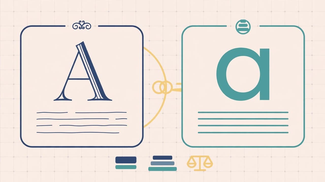
The oldest reliable trick in the book: pair a serif with a sans-serif. Headlines in a serif, body in a sans — or the reverse. It works because the two families are clearly different on one axis (letterform style) while both staying quiet and readable everywhere else. Two fonts that differ on three axes at once — different category, different weight feel, different x-height — make the page vibrate.
So: pairings fail by being too similar or too different, never by being too boring. Two nearly-identical sans-serifs don't read as a pairing; they read as a mistake, like you installed the font twice. Two wildly different display fonts read as a fight. Aim for distinct-but-cooperative: different enough that the eye instantly knows which is the headline, similar enough in proportions that they look like they could share a family.
The concrete version of "similar in proportions" is matching x-height — the height of the lowercase letters. Two fonts with similar x-heights sit at similar apparent sizes and feel related even when one is a serif and the other isn't. This is also why the laziest reliable shortcut works: superfamilies, type systems designed as matched serif and sans companions (Adelle and Adelle Sans, Questa and Questa Sans, Meta Serif and Meta Sans). You can't go wrong with one because the designer already did the pairing. The same principle explains why two typefaces from the same designer often pair well — Eric Gill's Perpetua and Gill Sans share strokes and curves the way two paintings from one artist share a hand.
Weight and size do most of the pairing
Most of what reads as good pairing is actually hierarchy. A page where headlines are 32px bold and body is 17px regular reads as intentional even with a single family. A page where headlines and body are nearly the same size reads as chaos even with a perfect serif-sans match.
Practically: before adding a second family, try doing the job with weight and size. A variable font with a good weight range (the Web Almanac now finds variable fonts on about 40% of sites) can be your headline bold, body regular, and caption light — one request, zero pairing risk. Many designers discover that their "pairing problem" was really a "I never committed to a type scale" problem.
The small optical corrections matter more than they should, too. Capitals at normal letter-spacing look cramped, so add roughly 5–12% extra tracking; keep full-caps runs to a single line, since multi-line all-caps measurably slows reading. And never let a decorative font touch body text or UI labels — thin display faces at small sizes are the web's most common typography sin in a costume.
The low-effort playbook that never fails
If you have no taste and no time, in order of reliability:
- One family, three weights. Inter, Source Sans, or any well-made sans with real weights. Headlines 700, body 400, captions 400 at smaller size. Impossible to get wrong — which is fine, because body text is 80% of the page and nobody ever bounced from a site because the headings were too tasteful.
- A superfamily. Pick a matched serif+sans system. Serif headlines with sans body is the classic editorial look; reverse it for a modern-tech feel.
- One display font plus one workhorse. If you want personality, spend it exactly once: a characterful display face for headlines only, never below 24px, paired with the most boring, legible body font you can find.
- Steal, then verify. Typewolf's lookbooks, FontPair, and Google Fonts' own curated collections show real pairings in real layouts. Copy one, then set the same sentence in both fonts at the same size and check whether they look related.
Two anti-patterns: never use Times New Roman or Arial — Butterick's line is that those signal "I never made a decision." And serve your fonts as WOFF2, self-hosted, with font-display: swap so text renders while fonts load — about 72% of sites now self-host, per the Almanac.
Your 20-minute font audit
Open your site and count distinct font families in the network tab. If it's more than two, you already know the fix. Then check the boring numbers: body text 16px or larger, line-height around 1.4–1.5 for paragraphs and ~1.1–1.2 for large headlines, line length under ~80 characters, contrast at least 4.5:1 for body text.
Only then — if the page still feels flat — consider a second family. Pick the body font first, pair for contrast on exactly one axis, match the x-height, and give each family a fixed job it keeps everywhere. Typography isn't taste. It's a checklist with good defaults, and the defaults are boring on purpose: they leave all the reader's attention for the words.
References
- Matthew Butterick, Typography in ten minutes — Practical Typography (body-text-first rule; 15–25px web; 120–145% line spacing; 45–90 characters per line; all-caps tracking guidance)
- HTTP Archive, Web Almanac 2025: Fonts — 88% of websites use web fonts; 72% self-host; WOFF2 ~65% of requests; variable fonts ~40% adoption; median font file 35–36 KB
- Nielsen Norman Group, Low-Contrast Text Is Not the Answer — minimum 16px body text; adequate line spacing; accessibility-compliant contrast ratios
- Typewolf lookbooks, FontPair, and Google Fonts curated collections — real-world pairing examples and superfamily references
Comments
More in Design & Creativity

The AI Boom's Favorite Number Just Dropped From $70B to $50B. Wall Street Noticed.
The FT says OpenAI's annualized revenue is $50 billion, not the $70 billion investors were using. Wall Street sold tech on the difference — here's why one disputed number can sink trillions, and what to watch instead of model launches.
Read more
Bangladesh Got Satellite-to-Mobile Before India. Your 4G Phone Didn't Change — the Sky Did.
Banglalink and Starlink launched South Asia's first direct-to-cell service on October 7: your existing 4G phone and SIM can now text and share location through satellites in dead zones. Here's how the orbital cell towers work — and what they can't do yet.
Read more
Apple's New CEO Just Made Himself Its Design Chief. He's an Engineer. That's the Point.
John Ternus visits Apple's design studio several times a week — Tim Cook came about once a month. Seven years after Jony Ive left, the CEO has made himself the company's design chief, and the bet is that one decision-maker beats a committee.
Read more