
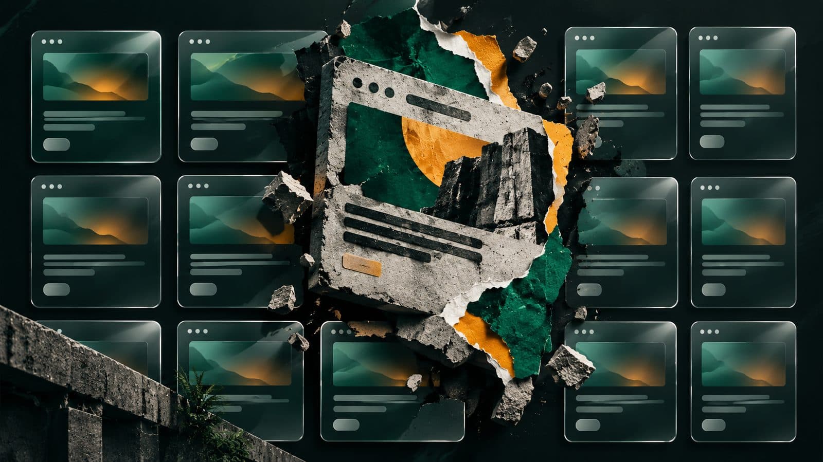
AI Made Every Website Look Identical. The Rebellion Is Deliberately Ugly.

Mahmud Hasan
October 5, 2026
Open a dozen AI-built landing pages and try to tell them apart. Dark background, gradient headline, three rounded feature cards, glowing call to action. You didn't design any of this. Neither did anyone else. That's the point — and it's exactly why some of the most recognizable websites right now look like they were built in 1998 on purpose. In 2026, looking polished stopped being proof of quality: an AI can produce a genuinely good-looking interface in an afternoon, for free. So a growing chunk of the web is going the other way — raw edges, visible structure, stylesheets you could print on a napkin. Not because designers forgot how to make things pretty. Because pretty became the default, and the default is the thing you can't afford to look like.
The average is the enemy
Here's the mechanic nobody wants to say out loud: a language model produces what is most likely given what it has seen. Ask for "a modern landing page" and you get the average of every modern landing page in its training data. The average is competent. It is also completely anonymous: it says nothing about what the product does or who it's for.
The convergence has an engine, and its name is Tailwind. Vercel's v0 ships React plus Tailwind plus shadcn/ui by default and was doing roughly $50 million in annualized revenue by 2026. It's not a conspiracy; it's engineering: styling sits directly on the element, so a model never has to reason about a separate stylesheet; there's nothing to name, which removes a whole category of mistakes; and the vocabulary is small and fixed (p-4 means exactly one thing), backed by a mountain of public examples.
The result: good-looking became close to free. But frictionless generation also deleted the exact moments where a human injects perspective — the friction of manual layout work was where original decisions happened. Now creators fall to design fixation: accepting the first plausible output, because modifying an automated template costs more mental effort than regenerating it. Not that AI produces bad interfaces. It produces good ones. The problem is that it produces the same good one for everybody.
From raw concrete to product grammar
Brutalism started as architecture — 1950s Europe, from the French béton brut, raw concrete. When it reached the web in the 2010s it became plain unstyled HTML: system fonts, default link blue, harsh layouts. A deliberate anti-design stance that Nielsen Norman Group later called "raw, harsh, unfinished, or utilitarian."
The term neubrutalism, popularized in the early 2020s by designers like Michał Malewicz, marks a real shift: this isn't raw HTML anymore. It's a productized anti-design dialect — the rebellious energy of brutalism turned into a repeatable, commercially usable interface grammar, more colorful and orderly than its predecessor.
The proof cases aren't portfolios; they're companies. Gumroad's 2021 redesign went fully neo-brutalist — thick black borders, flat pink and yellow color zones, hard-edged shadows, massive headlines. Polarizing, but it made Gumroad instantly recognizable, the entire point of a brand. Figma's 2024 refresh went the same direction: "unapologetically jumbo," playground-inspired.
Why now? The economics flipped. When sleekness requires zero human labor, visual polish carries zero economic weight. As Valorsic Studio's founder Pujan Aggarwal put it: if your website looks like an uninspected fork of every other competitor in the category, buyers see an organization without an independent point of view. So this 2026 wave — sometimes called tactile brutalism — isn't about being ugly. It's structural honesty: visible construction joinery, raw geometry, grid lines left exposed. Less about being pretty, more about proving a real designer made decisions in a sea of look-alike sites.
The recipe — and the line you can't cross
Neo-brutalism has a grammar, and it's more disciplined than it looks. Solid 2–4px black borders on every card, button, and input. Hard offset shadows — box-shadow: 5px 5px 0 0 #000 — with zero blur; any blur and it reads as Material Design. Flat solid fills, never gradients. Color zones the page: a yellow section, a pink section, a blue section.
Color is where most attempts die. The discipline is restraint: anchor in true black and a warm off-white (#FFFDF5), then allow yourself two or three saturated accents at most — more reads as kindergarten. The black keylines unify a loud palette: color blocks plus black borders reads as pop-art poster, not clip-art.
Typography does the heavy lifting: oversized, ultra-bold grotesque headlines — Archivo Black, Anton, Space Grotesk at 700–900 weight, often sized with clamp(3rem, 8vw, 8rem) — paired with deliberately calm body copy like Inter or Roboto. Even the motion is mechanical: 100–150ms, linear, no bounce; the signature move is the physical push, where a pressed button moves into its own hard shadow.
And the line you can't cross is accessibility. Bold color plus heavy type still has to hit ≥ 4.5:1 contrast for body text — exactly where amateur attempts fail (yellow text on white is the classic). Keyboard navigation has to work, focus rings visible. The real rule is consistency: one border weight, one shadow direction, generous padding. Discipline is what separates "system" from "mess": misalignment must be intentional and small, on a real grid, never accidental.
The quiet rebellion: stylesheets under 5 kilobytes
The same week, a different front of the same war played out on Hacker News. CSS Bed — a gallery of 28 classless CSS themes maintained by Yuriy (ubershmekel) — got rediscovered. Pick a theme, paste one stylesheet link into your HTML head, and the same plain page becomes readable, often genuinely attractive. No utility classes. No JavaScript bundles. No build step.
Themes like pico.css, water.css, and tufte.css style semantic HTML directly — h1, p, button, article get thoughtful defaults, no div soup. Most come in under 5 KB gzipped; Milligram weighs 2 KB and loads fully in 0.4 seconds on a simulated 3G connection.
The timing isn't random. Tailwind Labs was acquired by Shopify in September 2026 — the core stays free and MIT-licensed, but new sales of the paid Tailwind Plus library ended. Meanwhile native CSS grew up: container queries, :has(), nesting, and subgrid all enjoy broad browser support now. A lot of what frameworks were for takes a handful of native lines.
Honest scope: classless CSS fits content pages — blogs, docs, landing pages, MVP frontends. Dashboards and interactive SaaS still need precise control. This isn't a replacement; it's an exit ramp.
What to do about it
If you're generating interfaces with AI, the fix was never a cleverer prompt — it's constraints. Describe the product, not the page: "a savings app used by traders in Lagos who check balances between customers, on cheap Android phones" gives the model something to reason from, while "a fintech landing page" returns the category average. Name what you don't want. Bring your own color and type, or ask the model to explain what in your subject matter each choice comes from. Give one element a job nothing else has — a color that only ever means "delayed." And judge the design on the boring screens: the settings page, the empty state, the 40-row table.
If you're designing by hand, you don't need to go brutalist. But you do need one decision the average would never make — and you need to write the decisions down. The lasting value in any interface, generated or not, is the system inside it: the spacing scale, what each color means, how a button behaves in every state. Keep the decisions; the pixels are cheap either way. Sameness used to be safe — it meant you looked professional. Now it means you look generated, which reads as having nothing to say.
References
- CSS Bed Offers Classless Themes as Founders Seek Simpler Starts Amid Tailwind's Rise — WebProNews, Oct 2026
- The A.I. Design Trap: Why Every New Web App Looks Exactly the Same — Victor Anih, LinkedIn
- What is The Neubrutalism Or Neo Brutalism Web Design Trend — Design Studio UI UX
- Neo-Brutalism — Award-Grade Design Research Pack — lookbook (GitHub), citing Nielsen Norman Group, neubrutalism.com, Bejamas
- Why Every Website Looks Identical in 2026 (And What Replaces It) — Valorsic Studio, Medium
- Why Every AI-Built Website Looks the Same: The Nine Defaults — Medium
Comments
More in Design & Creativity

RAM Is Up 500% in a Year. Micron Just Extended the Shortage to 2028.
Memory prices are up fivefold in a year, and Micron's CEO says he cannot see when supply and demand rebalance. What the earnings call actually means for your next PC purchase.
Read more
Qualcomm Just Paid Huawei for Its Ideas. That's Not a Truce — It's a Receipt.
On Monday, Qualcomm and Huawei signed a multi-year patent cross-license covering 5G, AI, compute, and networking — and Qualcomm is buying some of Huawei's U.S. patents outright. Twenty-five years after Huawei paid Qualcomm its first licensing check, the money just flipped.
Read more
Citrix Says the New Zero-Day Just Crashes Your Appliance. The Honeypots Disagree.
Citrix calls its newest NetScaler zero-day a denial-of-service bug. Researchers watching honeypots saw downloaded malware executing instead - and every admin who patched the first two flaws has to patch again. Hunt first, patch second.
Read more